Tonight is trade night, so in honour of this time-honoured tradition both Harry and I (Sean) will take a look at what the media team has agreed (agreed may be a strong word) are the ten best jerseys at WCBU. Let us know what you think on Facebook and Twitter, and feel free to share any shots of jerseys you prefer!
Portugal black
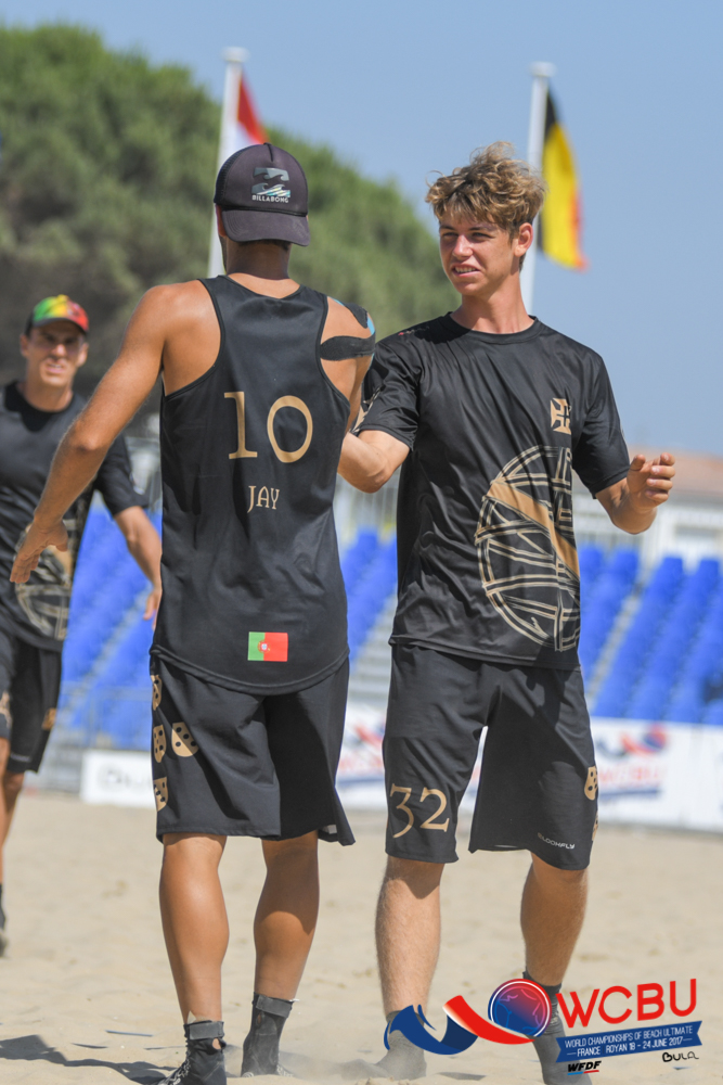
Harry: Ok, let me talk to you about how good this kit is. It takes the bad green/red combo the country uses, and rightly throws it out of the window. It then makes everything black and gold. It’s calm, cool, and screams style. Using symbols of heraldry which date from the middle ages, and a font which emphasises the general feel of the kit. You will feel like royalty in this kit, and be complemented by at least four random strangers. I guarantee it.
Sean: I agree that it’s a very good kit. It’s even not bad in vest form, which I usually dislike strongly. It’s very classic, and reminds me a little of a football shirt. The logo might be a bit big, but overall I think the effect really works. Black in this heat, though…
Venezuela red
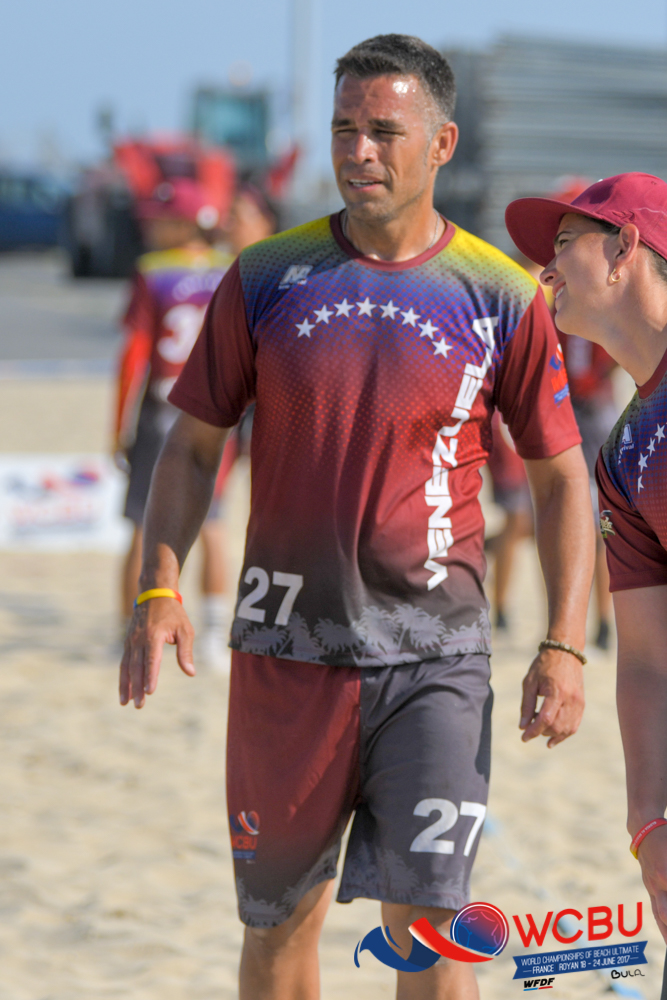
Sean: I hate busy kits. I don’t like shirts that look like they were designed by a committee and there’s a billion things going on. That said; I like this kit quite a bit. If you wrote down all the constituent parts you’d think that there’s no way they work together. But they do! Maybe it’s the dotting effect. We do need to talk about those shorts though… Not sure they work nearly as well as the jersey.
Harry: Go look at the Venezuela flag. You have bright yellow, blue and red stripes, with a semi-circle of stars. There’s a lot going on, and making a kit out of it could be a challenge for most people. Well, the Venezuelan team managed it. They made the red a lot darker, and made the red take up much of the jersey. And it looks great. This shirt should go down as a fashion triumph for all of history, and the genius behind it given a free beer or something.
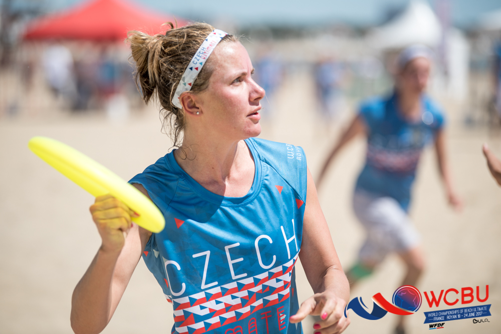
Czech blue

Sean: This is the best jersey here in my opinion. This one or the Czech white, which is also beautiful. They had great kit at WUGC 2016 in London, too. Czech designers clearly know their stuff. The lines across the middle of the kit are a great play on the Czech flag, and I love the font they’ve used as well. Strong, strong stuff.
Harry says: Do you like three-sided shapes? If so, I can’t recommend the Czech blue more. Their kit is covered with them. The kit manages to take the simple colours of blue, red, white, and grey, and they make it look over the top and busy. Couldn’t love it more, thoroughly recommend.
Philippines Men’s white
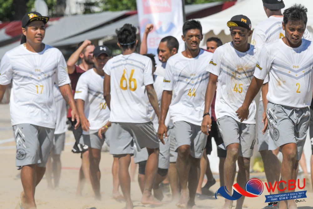
Harry says: So, here’s the thing. The Philippines kit already looked cool. It’s fresh, crisp, and actually a little reminiscent of the USA black kit from last cycle (which, while we’re on the subject, was much nicer than the current crop). And then you add the Philippines athletes. Add that to an already impressive kit, and you have a top you’d be willing to fight for. Not that you should. Non-contact sport and all that. Still. Good kit. Looks nice.
Sean: I would not fight for this kit. It is very nice though. I prefer this to their black, which is also very nice, because the gold and grey look great on the white background. Very cool overall look with the light grey shorts and the gold on the hats too.
Guam Mixed blue
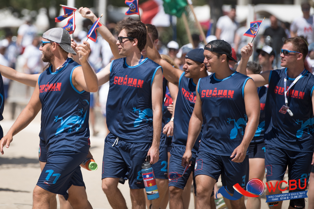
Sean: This is very simple, which I like. I’m not sure it’s a fantastic jersey but it’s definitely a nice one. I’m just not sure about that lizard on the side. Using Guahan rather than Guam is a nice touch, though.
Harry says: As we all know, when something is rarer, it is intrinsically more valuable. So, Guam turning up to their first ever WFDF event, in any division, makes this kit practically golddust. Not only that, it looks fresh. It only exists in vest form so you have to have the arms for it. But emblazoned with “Guahan” (Guam in local Chamorro) and in a stylish dark blue, this is a kit I’d recommend looking out for.
Malaysia Mixed white
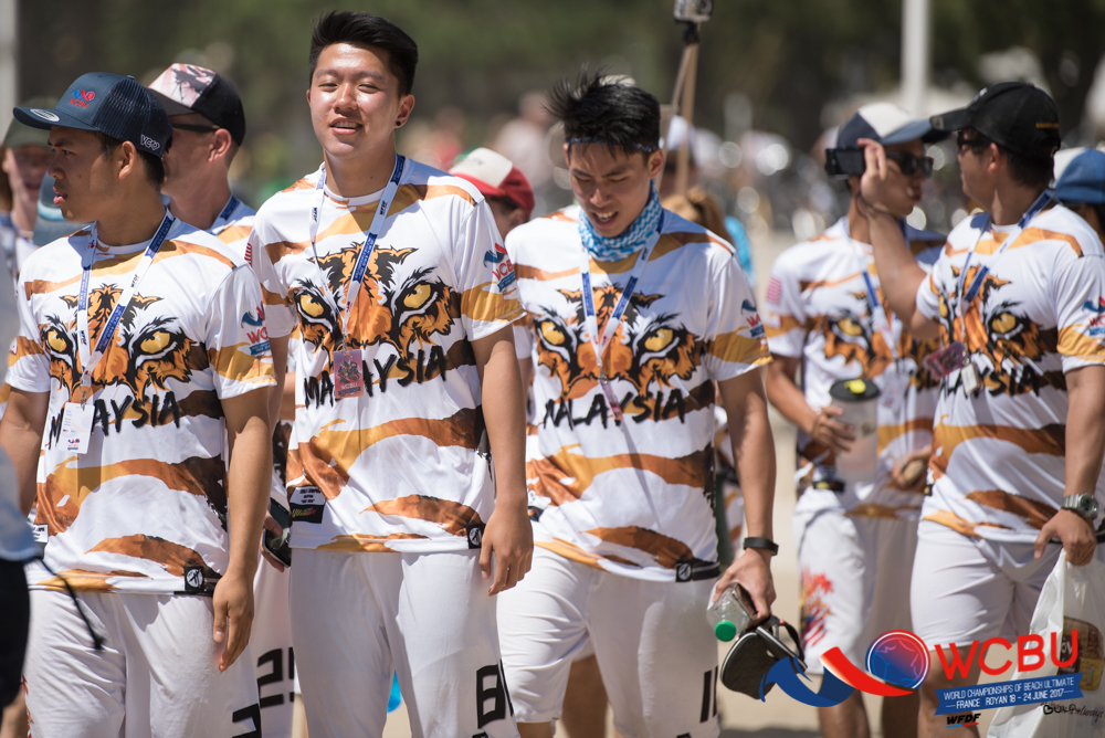
Harry says: Tigers don’t have noses. This is a controvertial fact in some circles. So credit to the Malaysian Mixed team for finally coming down on the side of #notigernose. It’s front and centre on their kit, and impossible to miss. If you want a conversation piece at parties, this Malaysian kit would be it. Unless, of course, you’re in the jungle. There, the bright orange camouflage stripes will adequately disguise you in an emergency. Multipurpose and functional. Everything you need.
Sean: Tigers definitely have noses. The overall look is a bit disconcerting if I’m totally honest, there’s an awful lot going on here. I like the colour of the stripes though, so I’m prepared to accept this as a good effort at the very least. I’m not sure I’d put it anywhere near a top ten list, but democracy rules so here we are.
Netherlands black
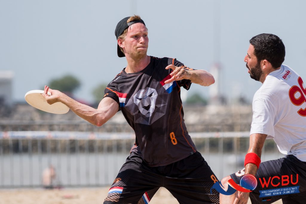
Harry says: Netherlands went for a bold approach here – to put an actual animal on their kit. This is either make or break for a lot of jerseys, with many falling short and looking like an MS Paint job. No such amateur approaches from the Netherlands. I love the way the lion looks, front and centre. A small dash of colour linking the lion to the armpits of the Netherlands players really adds…something…to the kit.
Sean: I mean, it’s nice. But it’s no orange is it?
Netherlands orange
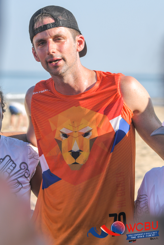
Harry says: So, the Netherlands orange takes all the good things about the Netherlands black and make it, well, worse actually. Look, I’m going to be honest. I like bright orange. But I really wanted the GerMENy vest of the German Men’s team to be one of the pieces in this article. I love puns, but I got vetoed by the office as “one of the worst kits they’ve ever seen”. I’m choosing my hill to die on, and I really hope this makes it past the edit. Wish me luck. But yeah. Good Netherlands kit.
Sean: I’ll allow this past the edit because it’s important everyone know Harry’s taste in jerseys is dreadful. On the shirt – now this is a Dutch jersey! This is clearly better than the black and I’m a big fan. If the jersey in this picture wasn’t rolled into a vest I’d like it even more. Very fitting for a nation whose football team is nicknamed Oranje.
Germany white
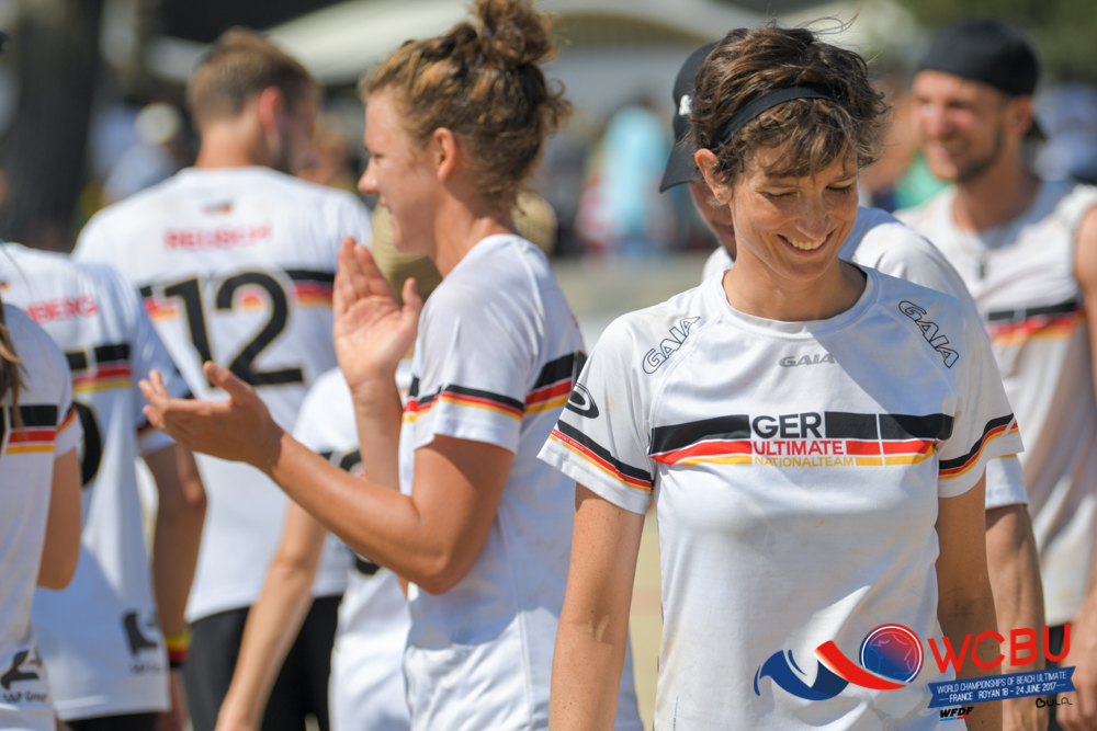
Sean: This is a typical German kit, in that it’s very clean and simple, and I like it very much. The flag colours around the chest are very understated and work nicely, as do the staggered logo lengths. The border around the number on the back is also very cool, and the red name is a good addition. I like simple, and I like this jersey.
Harry: Do you want people to know you have German kit? Do you love things clear, organised, and stating exactly what the kit is from? Well, get a German white kit. Your inner bureaucrat would be proud. This is a kit that screams “German”, albeit in a polite, not-too-loud fashion.
Denmark red
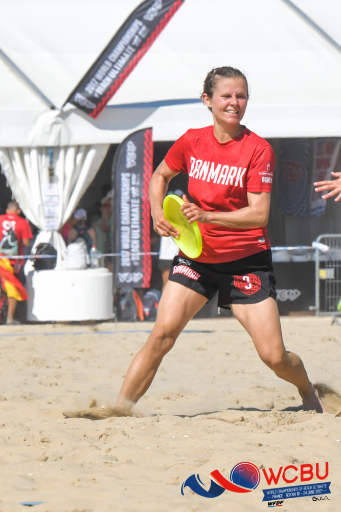
Harry: You may be too scared of the Danes to get close to them. My advice is, don’t be. Despite the intimidating beards of many of the players, they’re actually lovely people. You’re also missing out on the treat that is the detail of the Danish kit. It looks simple from a distance – plane red with “Danmark” in white. But when you get close, it contains this gorgeous sublimation, mixing dark and light reds in Celtic style knots. A really good example of how sublimation can be done really well. Also, get the longsleeve. Anything else wouldn’t feel natural from the cold country.
Sean: This jersey is fine. The sublimation is good, I agree, since it’s not wildly over the top and garish. But it is so subtle that it seems barely worth the effort. However, I love the shorts. And the font is nice too. Plus, it’s an excellent shade of red. So there’s still a lot to like, I just would have it lower down my list than some of the others above.